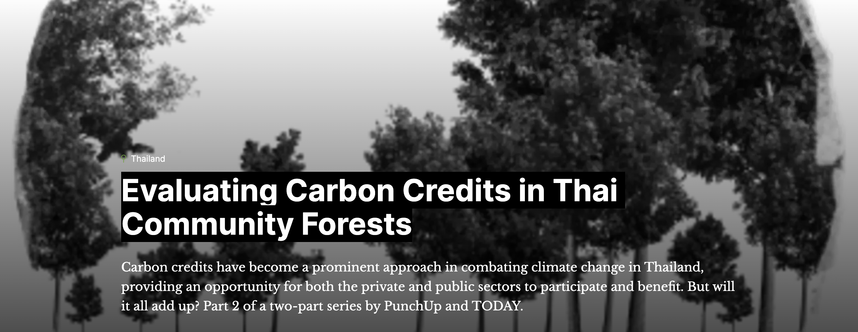
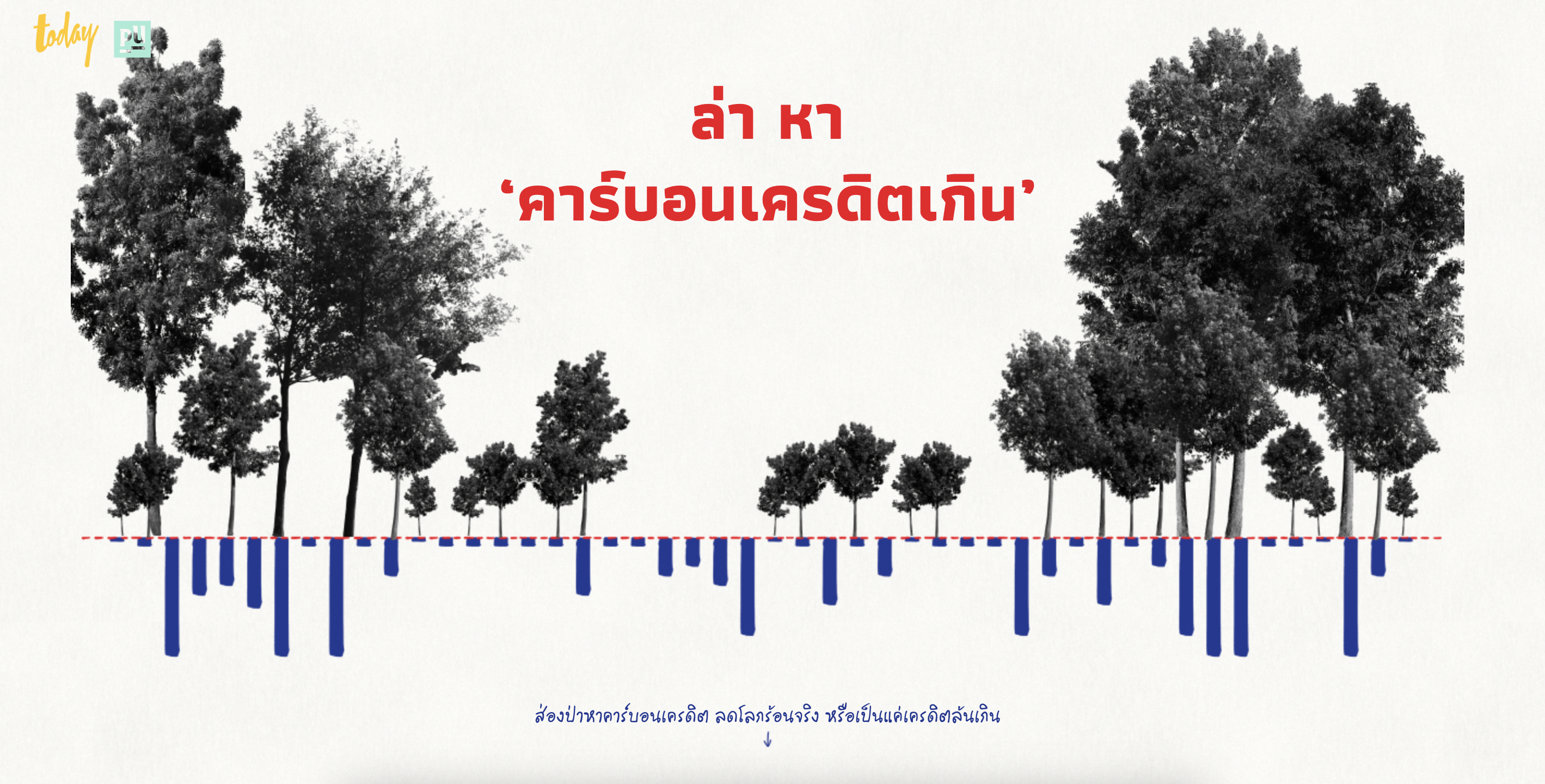
Skip to content

Project

Our selected projects
<Client> <>
โควิด-19 ทำให้เห็นอะไรในระบบสุขภาพไทย ?

ประเทศไทยพร้อมรับมือกับโรคระบาดอย่างโควิด-19 แค่ไหน และอะไรที่จะทำให้ระบบสุขภาพของคนไทยดีขึ้นกว่านี้ รู้จักระบาดวิทยาและเช็คความพร้อมของระบบสุขภาพไทยผ่านงาน Data Journalism ชิ้นนี้

This data journalism piece reveals how good is Thailand’s healthcare and efficiency in coping with COVID-19. The knowledge about epidemiology is also a key to this issue.

<Client> <>
คนกรุงเทพฯ มีพื้นที่สีเขียวไม่พอจริงหรือ?

พื้นที่สีเขียวของคนกรุงเทพฯ มีพอไหม? ที่บอกว่าพอ.. แล้วดีด้วยหรือเปล่า? งานชิ้นนี้จะคลี่พื้นที่สีเขียวทุกประเภท ทุกตารางเมตร ใน 50 เขตของกรุงเทพฯ ออกมาให้เราดู

Are there enough green spaces for Bangkok people? Some said yes, but is it also good enough? This data-driven work will unfold all types and every sq.m. of green spaces in Bangkok’s 50 districts to answer the questions.

<Client> <>
คนไทย.. ฝันเห็นประเทศไทยแบบไหนหลังโควิด-19

1,880 ความคิดเห็นจากคนไทยทั่วประเทศ ที่ร่วมฝันกันถึงประเทศไทยหลังโควิด-19 ถูกนำมาเรียบเรียงและวิเคราะห์ให้น่าสนใจและเข้าใจได้ง่ายขึ้น พร้อมเปลี่ยนข้อมูลดิบให้อยู่ในรูปแบบของ Wall of Dream

1,880 opinions of Thais about the country after Covid-19 were analyzed and portrayed to make the survey data more understandable and accessible, while featuring raw data into the Wall of Dream.

<Client> <>
117 ปี ภาวะโลกแล้งไทย

มองสถานการณ์ภัยแล้งไทยในรอบ 117 ปี ผ่านข้อมูลดัชนีความแห้งแล้ง SPEI พร้อมกราฟิกอธิบาย ‘ระบบฝาย’ องค์ความรู้ในการจัดการน้ำเพื่อความยั่งยืน

The situation of Thailand’s 117-year drought through the SPEI drought index gets visualized with a graphic explaining ‘Dam system’, the knowledge of water management for sustainability.

<Client> <>
คนไทยเห็น ‘บูลลี่’ แบบไหนในโลกโซเชียล?

ข้อความเกี่ยวกับการ ‘บูลลี่’ จากโซเชียลมีเดีย ถูกเก็บรวบรวมมาเพื่อตั้งข้อสังเกตและทำความเข้าใจด้านพฤติกรรมของคนไทย พร้อมคำอธิบายเพื่อให้เข้าใจบูลลี่ที่เกิดขึ้นในเชิงวัฒนธรรม

Messages related with bullying from on social media have been gathered, analyzed and narrated with cultural explanation, to give more ideas about bullying in the society.

<Client> <>
dtac Sustainability Report 2019

Sustainability Report ของบริษัทในแบบรูปเล่ม ถูกนำมาเปลี่ยนให้อยู่ในรูปแบบเว็บไซต์สองภาษา พร้อมใส่เทคนิค Data Visualization เพื่อช่วยให้เข้าใจและเข้าถึงข้อมูลได้ง่ายและสะดวกขึ้น

Company’s sustainability report has been interpreted into a bilingual website with data visualization, to make data and information more accessible and comprehensible.

<Client> <>
Punch Up x กสศ. : ทุนพัฒนาอาชีพที่ใช้ชุมชนเป็นฐานฯ

ข้อมูลและเรื่องเล่าความก้าวหน้าของโครงการทุนพัฒนาอาชีพที่ใช้ชุมชนเป็นฐานฯ ได้ถูกนำเสนอใน 3 รูปแบบ เพื่อให้ตอบโจทย์กับผู้อ่านที่หลากหลาย ทั้ง Scrollytelling, Exploratory Map และ Story Blog

Data and story of Community-based fund’s progression hosted by The Equitable Education Fund (EEF) are executed into relatable formats such as Scrollytelling, Exploratory map and Story blog.

<Studio> <>
Love Chart Quiz

ในช่วงวันวาเลนไทน์ Punch Up อยากชวนคุณมาวิชวลไลซ์หัวใจด้วยควิซคิวท์ๆ เล่นชิวๆ แถมได้รู้จักชาร์ตหลายแบบ ความรักของคุณเป็นแบบไหน? เล่าผ่านชาร์ตอะไรดี? ลองเล่นได้ที่นี่

On Valentine’s Day, Punch Up would like to invite you to visualize your love with this simple quiz that can interpret your relationship in different charts. What is your love like? Let’s play!

<Client> <>
Data Motion Story ยุติปัญหาเอดส์ ไม่ติด-ไม่ตาย-ไม่ตีตรา

เป้าหมาย ตัวชี้วัด และความก้าวหน้าในการดำเนินงาน เพื่อยุติปัญหาเอดส์ในประเทศไทย ถูกเปลี่ยนมาเล่าให้เข้าใจง่ายขึ้นด้วย Data Visualization ในรูปแบบ Data Motion Story

Goals and progress in ending AIDS epidemics in Thailand has been interpreted into Data Motion Story, applying some visualization and storytelling methods to make it relatable and comprehensible.

<Client> <>
ระเบิดเวลา PM 2.5 ลมหายใจที่หายไปกับฝุ่น

เปิดโปงผู้ร้ายตัวจริงอย่าง ‘สารพิษ’ ที่แฝงมากับฝุ่น PM2.5 ด้วยวิธีที่เข้าใจง่าย อธิบายเป็นภาพที่ชัดเจน เสริมด้วยข้อมูลจากงานวิจัยที่กระตุ้นให้ผู้อ่านเห็นถึงผลร้ายต่อสุขภาพ และปิดท้ายด้วยการตั้งคำถามต่อมาตรการภาครัฐในการแก้ปัญหาที่ผ่านมา

The story of toxic substances hidden in PM 2.5 has been revealed with visually and data-driven explanation, making the public easy to understand.